Disturbing 3D Visualization Will Change the Way You Think About Carbon Emissions
Disturbing 3D Visualization Will Change the Way You Think About Carbon Emissions

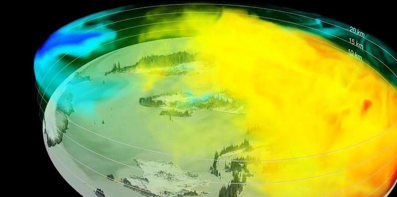
Scientists at NASA have created a stunning high-resolution 3D visualization showing the complex ebbs and flows of carbon dioxide in the Earth’s atmosphere over the course of an entire year. It’s a unique perspective that’s sure to change the way you think about this problematic greenhouse gas.
We’ve seen 2D visualizations like this before, but the new video, with its 3D view, is truly eye opening. Watching it, we can see the steady rise of CO2 in the Northern Hemisphere, and how this greenhouse gas is influenced by continents, mountain ranges, ocean currents, weather patterns—and even by highly photosynthetic regions like the US Corn Belt.
The latitudinal differences in CO2 accumulation are readily evident in this video, the result of more fossil fuel burning in the Northern Hemisphere, and the result of photosynthetic activity by plants, among other factors.
Roughly half of all human-caused carbon emissions get sucked up by the land and ocean, while the remaining half lingers in the atmosphere where it contributes to the notorious greenhouse gas effect. Visualizations such as this one are helping scientists gain a better understanding of which ecosystems—especially those on land—are absorbing CO2, and at what rates.
Importantly, scientists are hoping to learn if the land and ocean will continue its intense rate of CO2 absorption, or if we’ll eventually reach a saturation point. Which, in a word, would be bad.
Purabi Bose, Scroll.in
Be the first to post a message!